User Experience Designer on Gmail. We’ve
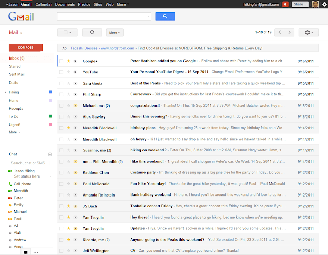
been hard at work to update Gmail with a new
look and I’m excited to share with you some
of the biggest improvements.
To start, we’ve completely redesigned the
look and feel of Gmail to make it as clean,
simple and intuitive as possible. In addition,
the new Gmail automatically adapts to fit
nicely in any size window. If you prefer a
specific display density, you can easily set
that as well.
Some people use a lot of labels, others chat
a lot. You can now adjust the size of the
label and chat areas to meet your needs.
Even if you do nothing, Gmail adapts to you.
The new look allows themes to really shine
and we’ve updated many of them with new
high-resolution imagery. You may want to take
a moment to check out one of the many new
high definition themes.
 Conversations in Gmail have been redesigned
to improve readability and to feel more like
a real conversation. We’ve also added
profile pictures so you can see who said what.
Searching is at the heart of Gmail. The new
search box makes it easy to customize your
search and find exactly what you’re looking
for. You can also create a filter from the
search box.
We’re excited to finally share the new Gmail
with you and hope you’ll enjoy the new design
as much as we do.


0 개의 댓글:
Post a Comment